Monday, March 29, 2010

when painting was architecture, and sometimes kites...

richardsmith1
richard smith, a whole year a half a day X, 1966

richardsmith4
richard smith, gazebo, 1966 (installation at the architectural league of ny)

richardsmith2
richard smith, western stile, 1968

richardsmith3
richard smith, passerby, 1969

richardsmith5
richard smith, threesquare 3 (pink russian), 1975

richardsmith7
richard smith, grey slice 1, 1975

richardsmith8
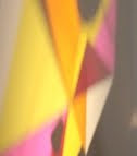
richard smith, bix X, 1975

richardsmith6
richard smith, big T, 1975

a few months ago i picked up a little catalog of the work of richard smith, called "richard smith: seven exhibitions 1961 - 1975". it was published by the tate gallery and seems to have been a re-installation of 7 of smith's key exhibitions - which seems a pretty interesting take on a survey show. i've been thinking a lot lately about smith's work, particularly two bodies, a series of shaped canvasses from the mid/late 1960's, and a series of canvasses attached to dowels circa 1975, that seem to be informed by asian textiles and kite forms.

i don't know that much about smith and his career (the book's texts are frustratingly vague, and i'm less inclined to do web research until i've digested the images a bit more...), but the ways in which he attempted to move painting into physical dimensionality (sculptural form) on one hand, as well as conversing with traditional craft languages (string, unstreched canvas, bamboo or dowels) on the other, puts his work of these periods into some really wonderful, odd, and traditionally "unsuitable" territory (and i'm wishing for once someone would write about the risks an artist like smith took in embracing such a craft aesthetic while clearly being immersed in hard edge abstraction, as i can't imagine similar painters being supportive of such a move).

in terms of my own interests i have a ton of respect for artists with this kind of restlessness, as much of the work feels more experimental rather than resolved - a very good thing in my own book, because it makes the work feel human rather than calculated.

as mentioned above, the earlier paintings use a hard edge abstract language, but the work also feels related to late british pop painting as well. the canvasses themselves contain actual physical shifts in the picture plane, with canvas stretched over low extrusions or small pieces of wood. in these works, smith explores stretched canvas over a variety of shaped structures, some individually simple, while others include many repeated forms with slight variations. his visual graphic language seems to dialogue with a number of british abstract artists at the time (robyn denny, paul huxley, etc.).

of course, there were other artists working with shaped/topographical canvas forms, but smith's work has a level of geometric simplicity and idiosyncrasy that gives the hard edge forms a feeling that they are rooted in the intuitive or the organic. certainly the images and their repetition are "designed", but the painted objects feel somehow connected to use - as if they were once ritual objects, whose truthful purposes have been lost, so that they have the freedom to be appreciated for their aesthetic invention, harmony, dissonance, etc.

with the 1975 works, smith leaves the traditional stretched canvas form behind, and begins to work with canvas over dowels that appear to be held together with string. these works begin to feel a bit like asian kites or african skin stretched shields, but the kite-like works also connect with richard tuttle's unstretched canvas and odd shaped paper pieces that hover between being a painting, sculpture, or object. unlike tuttle's penchant for small scale, smith's work - which does feel similarly quiet - is still conversing with large scale abstract painting, as a piece like grey slice (pictured above) is nearly 7 feet tall.

most of the writing in the catalog suggests that smith's earlier works which force the surface of the canvas off the flat plane, as well as his eventual leap into the larger kite works, are related to an interest in moving beyond the easel. the writers seem to view the leaps as a kind of formal concern to bring painting literally forward - i.e. off the stretcher bar frame. to my own idiosyncratic and somewhat illogical eye, it seems also as if smith's dissatisfaction with a flat canvas was less formal and more of a push towards the inclusion of the language of ritual and craft within an existing dialogue related to hard edge abstraction and british pop art (which i believe had already included more abstraction in its dialogue than here in america at the time).

by inserting a craft and/or ritual language into his work, smith seemed able to not only leave the flat picture plane of painting, but also the wall as a support structure. you can see this in 1966's freestanding "gazebo" made of 4 paintings, which resembles something like a tony smith sculpture, or an andrew geller beach house, more than anything to do with painting at the time. similarly mining his own spatial terrain, many of smith's later kite-like works were hung not from the wall, but from the ceiling. in these situations painting comes very close to becoming an extension of architecture. while some would dismiss these works as ornament, i believe they have the power, particularly through this language of in between-ness, to become sites for a variety of contemplations.

i remember having a conversation with a sculptor many years ago who commented in the usual sculptor vs. painter argument that a painting is simply a sculpture with a decorated surface. although certainly not exclusive to smith's work, what is interesting to me about his kite pieces - and in particular the ones hung from the ceiling - is that they really do hover between being a painting and a sculpture. i will admit that for me, there is nothing more tired than getting involved in the 'is it a painting or a sculpture' discussion; nor do i think that smith's work of this period was necessarily wholly invested in such drivel either, but i do love how much these works hover between a number of "acceptable" and "unacceptable" visual languages of the time.

Labels: , , , ,

Wednesday, March 24, 2010

when new things are actually old...

2010.03-ggrp

phonorec1

phonorec2

phonorec3

phonorec4

phonorec5

recently noticed an article on the great music blog disquiet about an advertising promo piece in the form of a record player made out of cardboard... you can see it in the top image, and also take a peek at with more info here

i wasn't quite sure if i should bash the thing for its faux "new invention" or give it props since it involves a vinyl record, but everything about it seemed too familiar to ignore, and after a few minutes of scouring the archives, i was able to locate the precendent...

pictured is a phonograph, coloring book and record contraption made by the barker greeting card company in 1955. this thing was quite an invention - a simple cardboard covered book with a tiny "needle" (that seems like a nail), and a rivet to hold a 7"record that could freely spin upon it. the record also has a tiny hole in it so you can turn it with a pencil... replicating the cranking activity of an old gramophone. its ingenuity and simple materials is worthy of tim hawkinson's work.

if you look at the picture of the new version, you will see that even the pencil turning mechanism has been cribbed from the 1955 version - not to mention the inclusion in the new version of a kid's record as well... so it seems hardly a coincidence of the design minded.

what this little story shows us is that all "new" ideas aren't necessarily new at all, and if you think you got there first, you probably got there third or fourth... or maybe it is that if you arrive third or fourth but you are quiet about precedent and wait long enough for the first to be forgotten, people will re-discover your old as new...

Labels: , , , ,

Monday, March 22, 2010

when captions are goodness....

Friday, March 19, 2010

when johnson built at muhlenberg...

IMG_1446

IMG_1447

IMG_1449

IMG_1448

IMG_1451

IMG_1452

IMG_1457

IMG_1454

IMG_1464

IMG_1459

one of the nice things about traveling to "work" in a building for a few days, rather than simply seeing it for a few minutes, is getting a feel for how it works, as opposed to simply how it looks.

i spent much of the past week in pennsylvania's muhlenberg college, working with students and engaging with faculty, all within philip johnson's 1976 dorothy and dexter baker center for the arts building. i don't usually like the term "quirky", but with johnson's work, particularly from the early 70's on, the term seems to fit - and the muhlenberg arts building has more than a few wonderful quirks built in.

the best part of the building, in terms of its use, is the central corridor that bisects the building, and which is topped with a continual skylight. while many of the interior spaces have no windows, the central core continually gives one a feeling of connection to the outside, with natural light, and views to the exterior landscape. it was brilliant during my week there, which was particularly weather-wonderful, moving from winter rain to the first few days of spring sunshine, although i'm not sure how pleasant it would feel during the hotter days of summer.

the other wonderful quirk of the central core is that it contains numerous evenly spaced "alcoves" on one side, allowing students to gather in places similar to those still watered inlets - great fishing spots - found along a rapidly flowing river. these spaces were not only populated by conversing students outside of class, but functioned also as smallish exterior crit spaces, where a teacher could meet with a student alone during class time - in an open space that felt nothing like a back room or an office.

like most institutional buildings, the offices were small and relatively unappealing, but in terms of the active life of students, it seemed to have a much more appealing atmosphere than many of the schools i've worked in.

the way in which johnson uses the roof pitch of a church, barn or schoolhouse as the uppermost spine of a modern structure is indicative of johnson's embrace of (ugh!) postmodernism, yet the whole thing really does come together, not as pastiche (as he was unfortunately capable of!), but as something struggling towards a modern structure reflecting the vernacular structures all along the periphery of the city. on one hand he seemed to be trying to reconcile the past and future stylistically, yet at the same time he pretty much ignored the traditional "hard" collegiate architecture of the earlier university structures that face the art building.

but johnson seems to have perfectly sited his transparent core - one entrance set of windows faces the existing buildings, while the other faces out towards a more natural landscape - giving every walk through the center of the space a feeling of transformation, as one continually moves throughout the day, back and forth, between visions of nature and culture...

Labels: , ,

Wednesday, March 17, 2010

gesthemane, grotto, and garden...

gesth1

gesth2

two images from a brochure of gethsemane circa 1920, images of the garden and grotto. something about the brown, the etched looking lines, the gothic tramp art combination of image building, as all seems to coalesce into some pretty wonderful images - seeming both menacing and lovely at the same time (i would say they are fraught with spirit). i encourage you to click on them and look at the larger scans. of course, no artist name anywhere... one more great lost anonymous illustrator...

Labels: , , , , ,

Sunday, March 14, 2010

some flat pianos...

Thursday, March 11, 2010

when alternative culture came to school...

L1070567

L1070574

L1070573

L1070570

L1070569

L1070568

L1070565

1967-1968 was a good time to be a student at the university of illinois, particularly because of their tremendous series of lectures under the rubric of "the university in motion".

here are some images of a recently acquired lot of cardboard posters used to advertise the talks. there is no designer mentioned, but they seem to have been designed by one person. they run the gamut of iconic humans in various endeavors of action and thought, including the premier of john cage's seminal work - musicircus, and a talk by bucky fuller.

the events, many of them part of a symposium in november of 1967 included such academic rock stars as: saul bellow, leo lionni, harold rosenberg, merce cunningham dance company and john cage, gunther schuller, charles wuorinen, buckminster fuller, stan vanderbeek, and others. topics ranged from avant garde music to the vietnam war.

cage's musicircus featured " lajaren hiller, herbert brun, kenneth gaburo, david tudor, gordon mumma, toshi ichiyanagi, and a ton of other people, including "others present in spirit". in the recent past, musicircus was recreated at the tate, as well as the mca chicago, using 300 - 500 musicians.

Labels: , , , ,

Tuesday, March 09, 2010

roden family music live on ear meal...

twogents

on wednesday evening at 9:30 PM pacific standard time, i will be performing live via the web with my uncle jeffrey roden (whose last CD was released on new albion records) on the web based sound/video program "ear meal", which is produced and presented through alan nakagawa's collage ensemble. this will be the first time jeffrey and myself will perform together. he will be playing electric bass, i will be playing a variety of acoustic objects/instruments. all will be improvised of course...

you can access the archived broadcast here:
unitedartscene

and if you miss it live, all of the broadcasts are archived at the same link... past shows include carl stone, joseph hammer, mark wheaton, and others. upcoming on future wednesday evenings will be robert crouch, greg lenczycki, rick potts, rene petropolous, anna homler, and others...

Labels: , ,

Monday, March 08, 2010

when tools for reading become tools for writing...

phraseO1

as if
milk really came
from the farm.

as if
there were a stop sign
at the top
of the hill,

where the coat
was wet
and its colors ran
down...

"jump like a little fire,
onto the black colored
ground".

a spark
came down
the hill,
to rest upon
the trunk
of this tree.
burning a mark upon the area
which would eventually
be chopped down
to make a door.

a saw then cut, while a hen did cluck
on the top of a big fence
as if
to give the tree
one last wish
to remain a tree,
in spite of things.

phraseO2

i move
from soon
to where
the nest
holds a girl
at rest,
cold from wind
that's fast.

at three
in the morn
those leaves
rustle for ear
and eye,
and i thank them
for they are old,
unable to fly
as they did when the wind
would call
and they would see
who would fall
and land
on their feet -
upon his hair
or both his shoulders -
as dust is most likely
to do,
while we too
have the need
to rest.

phraseO4

i have not a car,
but a bed -
and all but she
sleeps
in a box, instead
as you come
to me
like a fish
looking for lost eggs.

you said
they were those small ones,
that are usually red
and i stood there
silently,
upon one leg -
a man at play
who wants to go,
yet is
still,
always.

phraseO3

indeed,
i can get a pig
to eat corn,
in fact
some for him
and some for me.

it's good to share here
near the dog
and the boy -
as we
can all bear each other
and we
are toys that run,
and move
only for the sun -
which drops light upon
the cap
of the mountain.

then he, the pig,
tires of the light
wishing only
to be done
with it.

Labels: , , ,

Saturday, March 06, 2010

...

Thursday, March 04, 2010

when something is missing and something is added... (before photoshop)

tophead1

tophead2

here's an rppc of a musical family, circa 1905. as you can see, the photographer cut off the top of one of the musician's heads. fortunately one of the more artistically inclined family members drew in the missing features. some would call this defacing, while others would call it resuscitation... regardless, it was a nice "fix" by somebody...

Labels: ,